
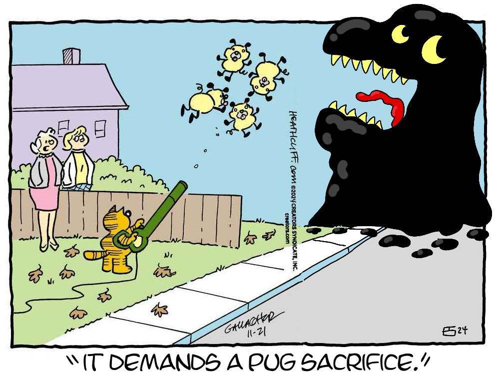
The sequel to It Follows.
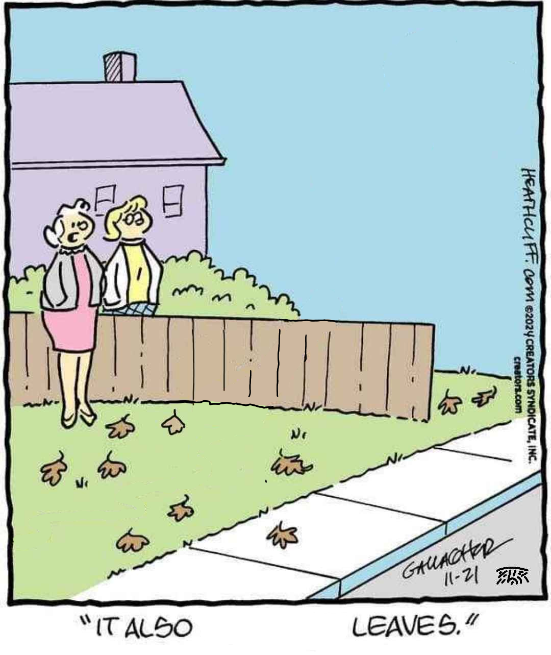


The sequel to It Follows.


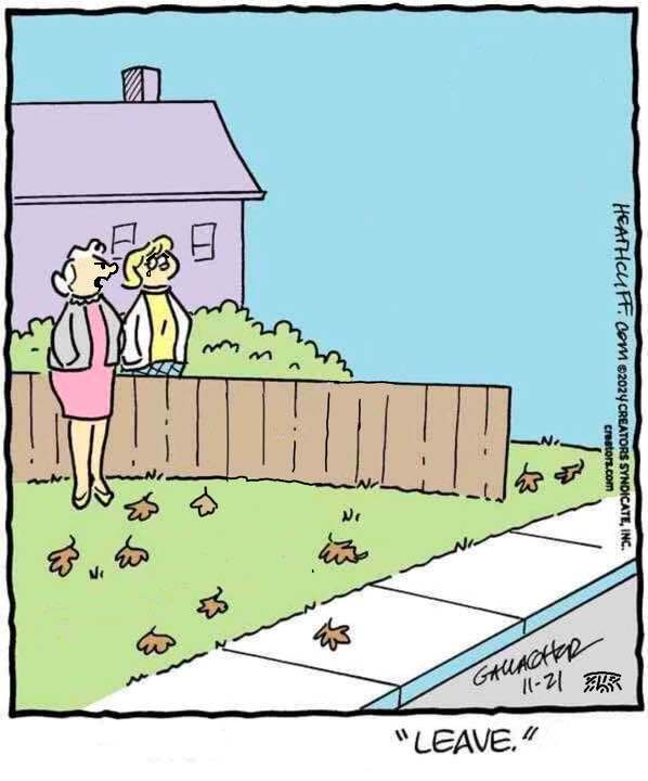


You’ve done enough edits that you should sign them. This way no one thing I made this, even though I approve it.


But don’t let NAPG see this.


No apologies needed








I would have failed every design class I took in college if I submitted that. Why such wide kerning? Why lower case but upper G? Why so round? Why so completely unreadable at a distance because of micro serifs? There isn’t one good design element in this.
Could be worse. It could be a Cisco WS-C3650 series switch.


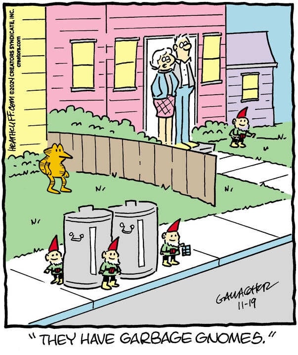


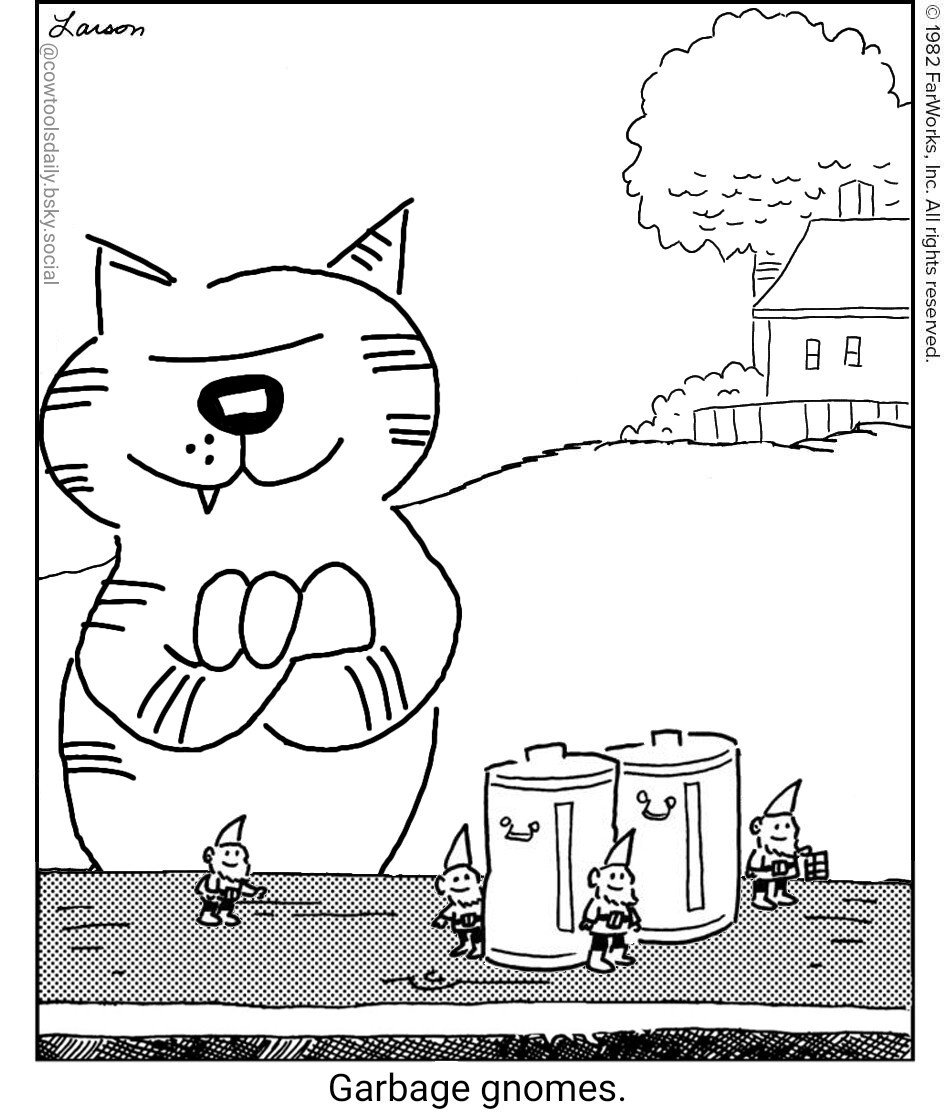


There really is a community for everything.
I don’t get it. They don’t even use money. How did they pay for those wigs?
Jessy Custer approved.
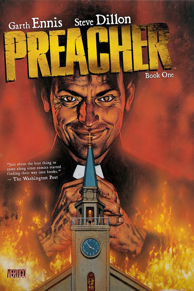
I recognized him immediately because of those podcasts.
The “a” is the worst part for me. You can’t see those little stubbs at a distance. So it reads JoGuor at a distance. They didn’t just fail to create a good logo, they failed to preserve the name. One bit of advice I always give is “imagine this logo on the back of a golf card or a Pride brochure. If the logo isn’t crisp and readable in black and white in a 1/2 inch square then it sucks.” This design fails that test. Not just because of the messed up “a” but the wide spacing makes those unreadable "a"s even smaller than if the letters weren’t so widely spaced.