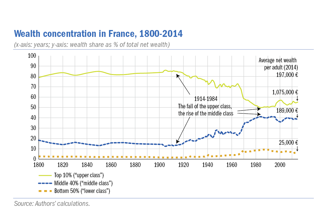
What does France’s distribution look like these days?
I found a couple of interesting graphs:

I dont really like how this first one divided their different groups (there’s probably a fairly major difference between the lower end of “middle class” and the top which brings up their percentage) and the way percentages work really skews the scale, but it does paint a similar picture. This second one is the more interesting, I think, because it shows that income inequality is pretty similar across many countries - before taxes. Taxes seem to be the big equalizer in other countries, with France going from slightly worse than the US before taxes to roughly two times closer to “perfect equality,” according to the metric they used, which puts it nearly on par with Sweden, who is miles ahead of every other country before taxes. This alone doesn’t say anything about wealth inequality due to how the wealthy actually live and use their wealth, but it does paint a picture of how closing tax loopholes can work.

Now show the top 0.01% as their own bar


