
I’ve been using LawnChair, and they’ve dropped the feature for some time. I think it was being re-written from scratch. It just got back in the last month or so.
Global namespace extremist. Defragment your communities!


I’ve been using LawnChair, and they’ve dropped the feature for some time. I think it was being re-written from scratch. It just got back in the last month or so.


Way beyond fist shaking here. My brain simply doesn’t process the trendy flat UX. It looks like when my kitchen garbage can tips over. A piece of carrot here, empty milk crate over there, sprinkled with onion peels, and some unidentified goop that I only discover later in the evening, using my bare feet, while getting a cup of water…
What’s weird though is that I similarly hate the circle android icons. They all kinda blend together like a bowl of skittles. Make them squircle though… instantly recognizable!


Hope not. The new translation tools is great.


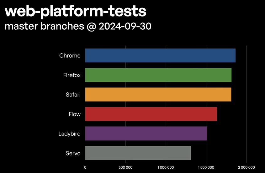
For a relatively long time I was under the impression that Servo is pretty advanced, but after the last weeks news, I’m not so sure anymore.

… is the most upvoted stackoverflow answer.
Reminds me of chakra linux. Same principals, except built on top of Arch base, and the other toolkit apps were distributed as self contained image files.