
I fucking adore Zach Freedman! Happy to see him getting some love 😊
Hello, my name is Cris. :)
I like being nice to people on the internet and looking at cool art stuff


I fucking adore Zach Freedman! Happy to see him getting some love 😊
Thanks for the context, that’s a fantastic explanation and I can see how it ended up used the way it is today!
THATS A FUCKING EXCELENT FACT.
Thank you for blessing me with this knowledge

I don’t work nights (yet) but I have a severe circadian rhythm disorder and schedule disorientation can be awful. Sorry it’s messing with your sleep friend 🫂
Love this ❤️
Can’t believe you’d suggest that’s the only way thigh-highs would be good for programming, I’m insulted
I think you have these swapped lmao


That looks awesome! I’m deeply nostalgic for that period of time, material design was the big thing when I was first getting into UI design and I was absolutely in love with it
Klwp and Kwgt are still a blast, that’s what almost all of my stuff is made out of, but iOS has its pros as well :) from what I hear things are progressively getting a little more customizable, if still pretty locked down
At some point I’d like to get a little better at animations so I can make my setup feel a little more alive, but for the time being it’s mostly just static elements


Lol, I’m somewhat similar. I’m a big ui/ux nerd but don’t have professional or academic experience other than some pro-bono work in high-school. But I love tinkering with my phone’s homesceen and other similar little projects. I’m hoping to make a neocites page soon!
This is my previous phone’s homescreen I posted a while back:
https://mastodon.online/@CrisColor/111440259435482295
I’ve gotten a new phone since then and am still getting it updated to fit properly on a new screen, so right now it looks a little jank 😅 but it’s always interesting to hear how other people feel differently about aesthetics than yourself!


Interesting, thanks for sharing your perspective with me! ☺️


I’m curious how you feel about the GNOME application icons, they sound like they might be up your alley
Right now I generally have a preference for either weird stylized themed stuff I make myself, or very flat stuff like what android currently does for app icons, but I can certainly see the appeal of other stuff :)
I really like the application icons used in Gnome but I really like the consistent line weights and geometry of material symbolic icons so I’m still using a material icon pack on gnome
Edit: Here’s a picture I grabbed of icons done in the adwaita style Gnome uses in case you don’t use linux and aren’t familiar with them. Its not a full sampling, but you get the idea :)
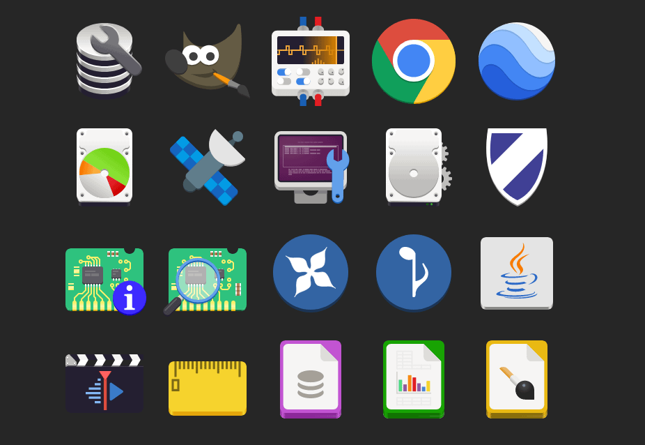


Personally I don’t, I kinda hate old skeuomorphism 😅
Neo skeuomorphism has some neat novelty though.
Edit: this is just my personal aesthetic preference, I don’t begrudge anyone their love of skeuomorphism, or nostalgia for it.
Lol, thats a whole lot of scrolling on my mobile client 😅
Its worth knowing that lamps are bad for moths, they think nighttime light sources are the moon which they use for navigation, and so they get confused and lost
If you wanna help moths, combatting light pollution so they can enjoy the moon is the best thing we can do for them :)
This might be one of the most tublr things I’ve ever seen in my life. I don’t understand it, but I do recognize it


For me, it’s just that something about the delivery and setup feel like they communicate I’m about to experience a very different kind of joke, and so the non-sequitur “I’m piss” catches me completely off guard in a way that makes me cackle
I think humor that depends on seting up and then subverting expectations with something dumb or nonsensical is often very hit or miss. But that sense of humor is increasingly popular, especially among gen z
What weather app is that?